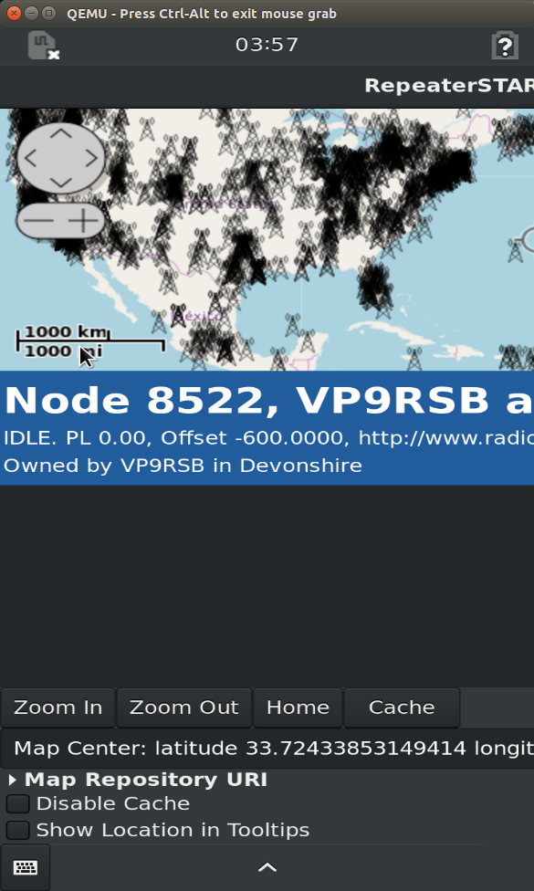
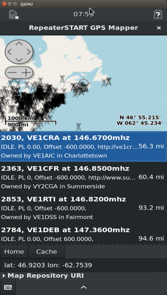
With a working Linux application, it’s time to test it out on a real (well, virtual) device. Starting up the emulator for debugging in the same way as before, to debug this project I ran:
sudo qemu-system-x86_64 -boot menu=on -drive file=qemu-x86_64.qcow2,format=qcow2 -vga virtio -m 2G -enable-kvm -net nic,model=virtio  -net user,hostfwd=tcp::2222-:22
scp -r -P 2222 ./Repeater-START/ purism@localhost:/home/purism/
On the phone I installed the OSM library and ran the script which opens the view:
sudo apt install gir1.2-osmgps*
cd Repeater-START
./repeaterstart.py
Unfortunately the width of the phone goes way out, similar to how the width expands on desktop, when the list completes. This is one thing that has to be considered on the smaller screen devices like Librem or any small screen Raspberry-pi based devices!

This is pretty annoying and requires you to drag the top window control to move the window around on the screen. Weird. We can detect whether this is a mobile device using the width and height of the screen as noted in this answer. On the Librem this shows width of 360px, and height of 720px. On Desktop mine shows the 1920×1080 standard resolution. Rarely will any users be on a width <800 on a desktop anymore, so we should be able to detect phone device and downsize the text accordingly:
In the __init__:
self.mainScreen = Gdk.Screen.get_default()
and set the smaller size in the Librem:
        if self.mainScreen.get_width() < 800:
            #mobile
            label1.modify_font(Pango.font_description_from_string("Ubuntu Bold 16"))
        else:
            label1.modify_font(Pango.font_description_from_string("Ubuntu Bold 22"))
It still is stretching the window, like it expands the window on desktop – and notice that example from the ScrolledWindow lines:
scrolled = Gtk.ScrolledWindow()
scrolled.set_policy(Gtk.PolicyType.NEVER, Gtk.PolicyType.AUTOMATIC)
This is from an example, but it’s easy enough to get the exact parameters of what that function does on the scrolled widget. In the terminal:
$ python3
Python 3.5.2 (default, Oct  8 2019, 13:06:37)
[GCC 5.4.0 20160609] on linux
Type "help", "copyright", "credits" or "license" for more information.
>>> from gi.repository import Gtk
__main__:1: PyGIWarning: Gtk was imported without specifying a version first. Use gi.require_version('Gtk', '3.0') before import to ensure that the right version gets loaded.
>>> sw = Gtk.ScrolledWindow()
>>> sw.set_policy.__doc__
'set_policy(self, hscrollbar_policy:Gtk.PolicyType, vscrollbar_policy:Gtk.PolicyType)'
As you can see, a handy thing about Python is you can explore the function help for different parameters and hints without looking up documentation, and test various methods and see if they work or cause exceptions, in the Python terminal. In this case those two parameters are for horizontal and vertical, let’s set both to Gtk.PolicyType.AUTOMATIC and you will see the window doesn’t expand its width.
While this makes it better, it is scrolling and that’s still not a great user experience, instead you can ellipsize (…) the labels as necessary, and make the labels smaller:
        label1.set_ellipsize(Pango.EllipsizeMode.END)
        label2.set_ellipsize(Pango.EllipsizeMode.END)
        label3.set_ellipsize(Pango.EllipsizeMode.END)
        if self.mainScreen.get_width() < 800:
            label2.modify_font(Pango.font_description_from_string("Ubuntu 10"))
            label3.modify_font(Pango.font_description_from_string("Ubuntu 10"))

        if self.mainScreen.get_width() < 800:
            #mobile
            label1.modify_font(Pango.font_description_from_string("Ubuntu Bold 12"))
        else:
            label1.modify_font(Pango.font_description_from_string("Ubuntu Bold 22"))
Another thing to consider is removing all unnecessary buttons on the main screen, on a mobile app for a smaller screen. Zoom in and out are redundant having two more buttons below, as is the don’t-use-cache option where a mobile device will often be off of wifi. I removed these as well and this makes a much cleaner usable mobile user interface:

The full diff of this can be found here on Github. So, in conclusion:
- Use GtkScrolledWindow when needed, but ideally lay out forms so that they do not need any expansion to the right or left. Just like on responsive websites, scrolling left and right is annoying!
- If not critical information for the mobile view, ellipsize.
- Consider the screen real estate and keep the items most likely to be used on the top level. Keep it simple!
In the next post, see how you can use Geoclue to see where you are and get the current location in Python!
