In a previous post I showed some interesting facts about Zipf’s law and how many different things show a pattern of logarithmic decrease with the most popular or numerous item largely being much more so than the very rare ones – in a logarithmic pattern. Let’s look at that pattern and how you can chart it…
It has been said this pattern affects all human languages, and even the language of dolphins and other animals? Either they are smarter than we give them credit for or the transferring of any messages in any sort of “language” tends to a few common words than it tends to an even distribution of words/ideas. It’s also been found to be the case for use of streets and highways, populations of cities, and other areas this pattern pops up. In fact, years before Zipf’s discovery, physicist Felix Auerbach wrote a report (translated to English here) that details how sizes of population centers or countries matches this same inverse pattern, more generally called the “Power law“.
You can see this yourself by grabbing a number of text from Gutenberg or other online source and running them through a counter such as this.
Copy the text of these books from Gutenberg or another online source, together and you can get a big text file (For example, some of Shakespeare’s works, Chesterton’s works, the whole bible in a text file). Now an online counter like the above will likely not work with such a large text, so you can build a Python script similar to the previous url counter, but going word by word reading a text file:
Python3 Word Counter:
#!/usr/bin/python3
from collections import Counter
import sys

with open(sys.argv[1]) as infile:
	counts = {}
	for line in infile:
		for word in line.split():
			if word in counts:
				counts[word] += 1
			else:
				counts[word] = 1
	wordcounts = Counter(counts)
	nth = 0
	for c in wordcounts.most_common(100):
		nth += 1
		print('No. %s,%s,%s' % (nth, c[0], c[1]))
Now find the frequencies at the command line calling the Python script above as shown, redirecting output out to a .csv file you can open up with Excel/Libreoffice Calc or other spreadsheet program:
python3 ./counts.py ./WorksOfChesterton.txt > chesterton.csvCharting the pattern
With the data opened, select data from columns B and C in the Spreadsheet, select the chart button up top and set up a chart XY chart with these second and third columns:
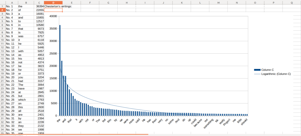
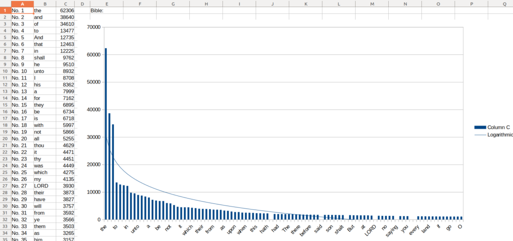
Right click the data itself and add trendline in Libreoffice, choose logarithmic, and you will see it roughly matches the same logarithmic power. How about the same with books of the Bible?
By the same process you’d get:
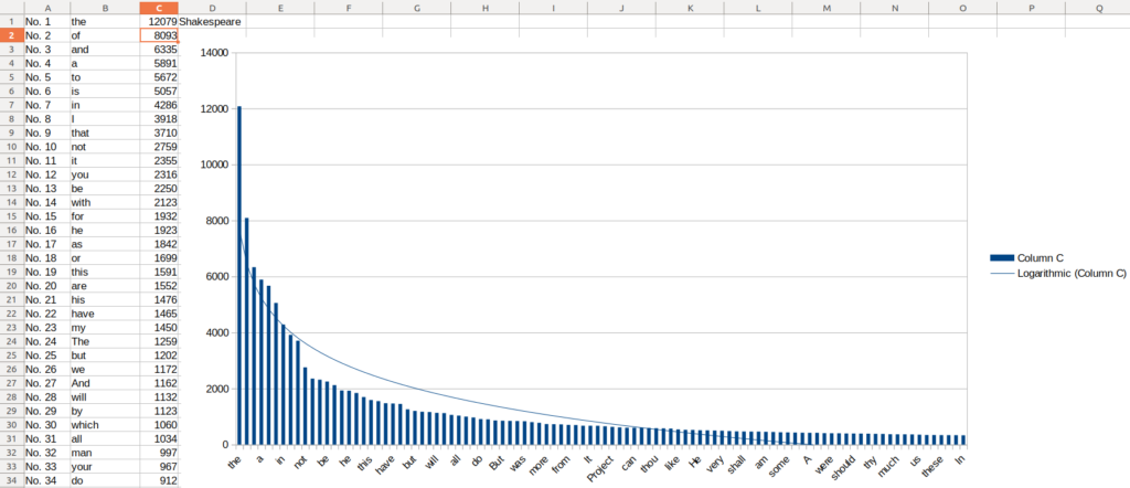
What about others, such as various works of Shakespeare?
Try it yourself and see what other patterns you can find that match Zipf’s law? Michael on the Vsauce channel on Youtube had some interesting thoughts on this:
Charting Logarithmically
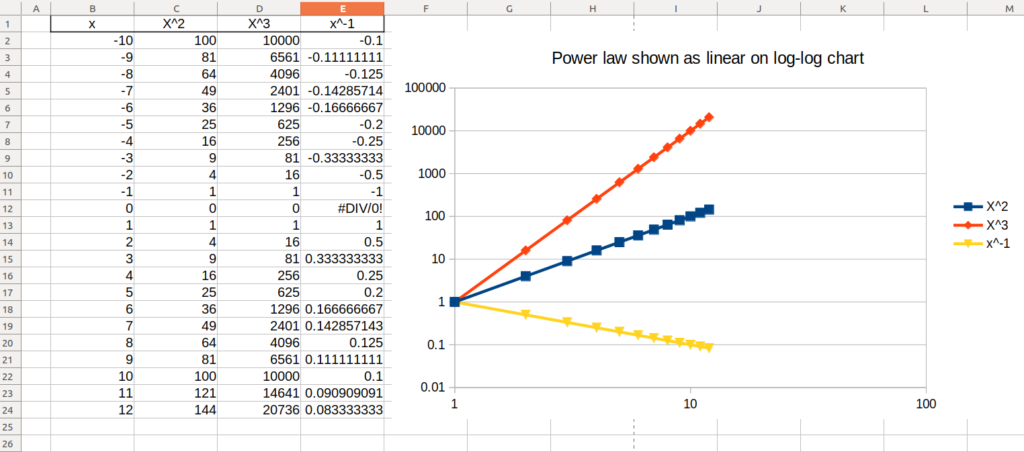
An interesting feature of log-log charts (charts in which the axes are evenly spaced logarithmically, evenly spacing “1 – 10 – 100” where a usual chart would space “10 – 20 – 30 – 40…”) is that a power function (y=x2, y=x3, y=x-1 etc) will look linear. You can verify this on a chart in Libreoffice/Openoffice by choosing a XY chart like so:
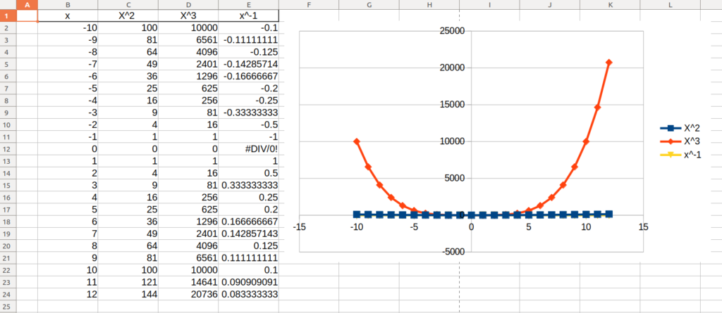
To chart a log-log chart, create a X Y scatter plot as above and then double click to enter the chart, select the X axis line, right click and choose “Format Axis…”:
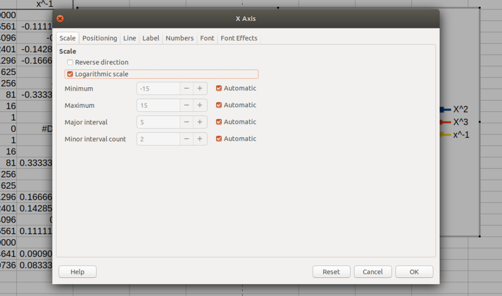
Select the Logarithmic scale option, OK.
Chose the Y axis line and right click, choose “Format axis…” and check the logarithmic scale also as above.
Now you will see the chart as shown below – where the power function turns in to a line!