If you live in Oregon you may have seen one of these research papers mailed to you along with a short letter promoting Noah Robinson for Oregon senate. Since this report is claimed on the campaign website to be “the most widely read scientific review article on “climate change,” which shows that human use of hydrocarbon fuels like gasoline is not changing the earth’s climate“, and the data in the charts ends at about the year 2000 for many charts as of its publishing, I decided to get some more recent data to research the most recent trends:
Since my expertise is not earth science or climate science (in fact, neither is Robinson’s, he majored in Psychology), I will not go deep into critique of the descriptions and figures, but rather link more up to date information than was shown both in the document and also his website slides.
Sea Surface Temperature
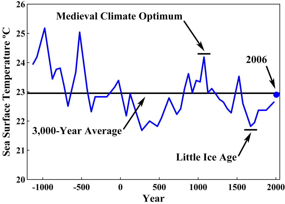
Robinson’s first chart, a charting of a part of Sargasso Sea. According to NOAA this region is the only sea without a land-boundary. Interesting! It is defined by boundary currents, and it is a crucial habitat for sea life and algae. I am not sure if this area was chosen for its importance to overall Atlantic’s health or because he found it useful to prove a point.
Note that in both of these charts, the apparent difference is smaller than it looks, yet an relatively small average temperature change can result in some drastic effects.
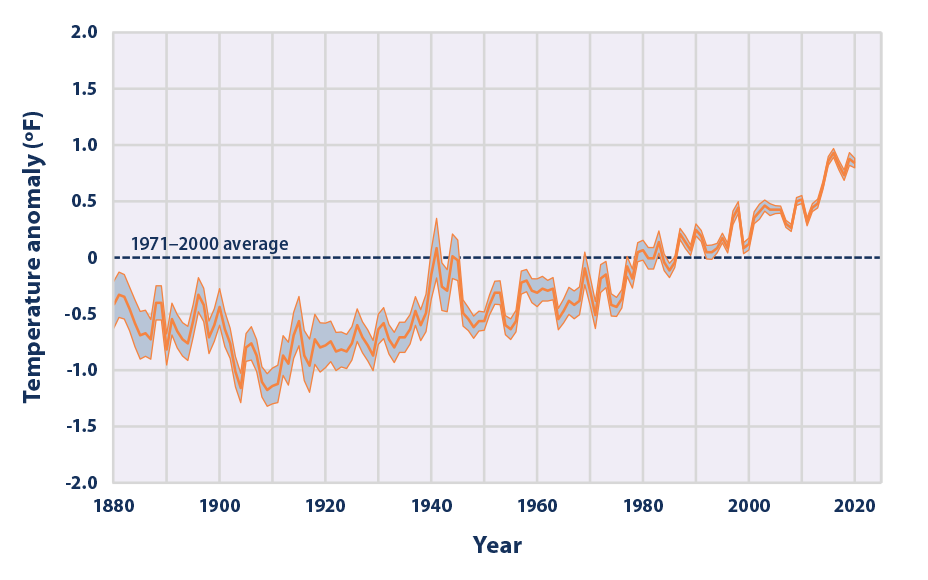
The latest EPA data, available here, shows over a hundred years of direct, instrumental measurement, and is showing a steadily increasing warming. “at an average rate of 0.14°F per decade”.
Solar Activity
Note that in both of these charts, the apparent variation is not actually that much – Robinson’s chart seems to be off quite a bit from actual global solar irradiance, and in both of these charts the changes are exaggerated – like zooming in on a nearly straight line:
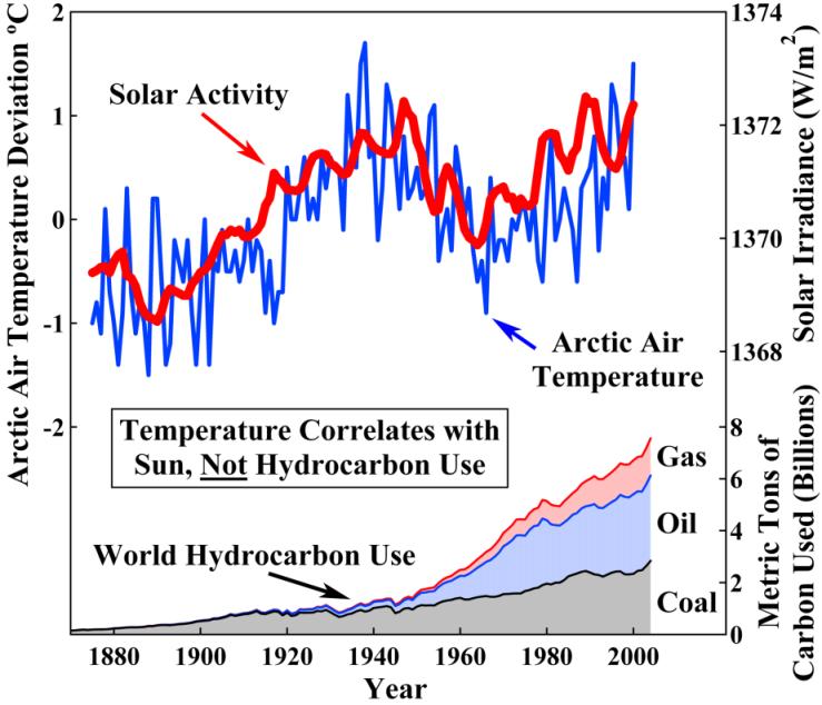
Why is arctic air temperature here compared to hydrocarbon use? It looks like the solar irradiance values are off compared to official statistics as well.
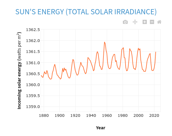
Matching data for TOTAL solar activity by measured sun spots. From https://www.climate.gov/climatedashboard.
Note that on the left the variance is actually <2 watt/sq m. and this actually about 0.1% variance between the years shown here, 1880-2020.
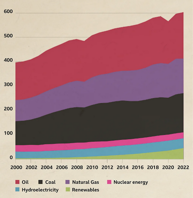
The world hydrocarbon use for more recent data does indeed continue to grow for coal and oil – but renewables also have multiplied since 2000 – that’s some good news coming from last year’s BBC report:
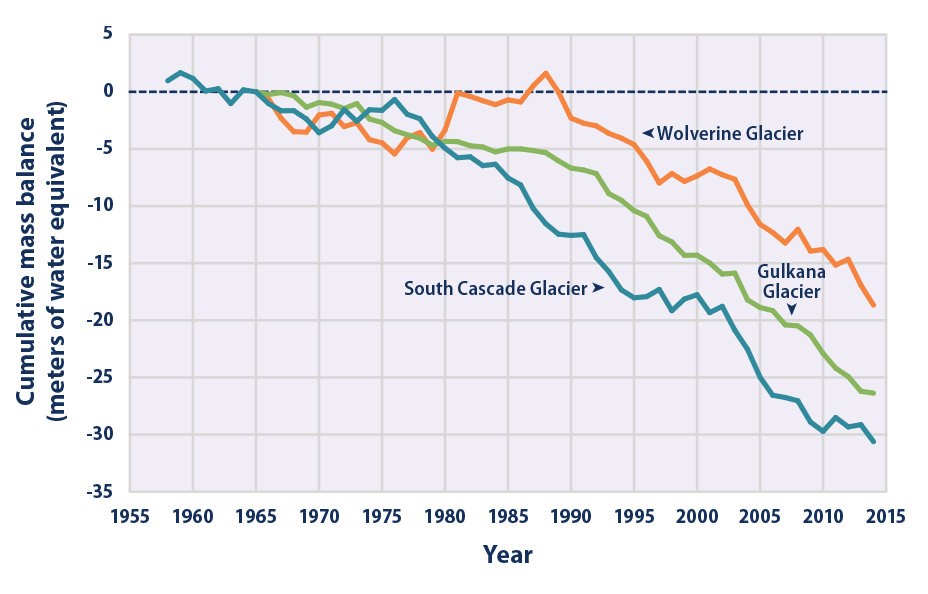
Glaciers
Robinson’s graphs, again:
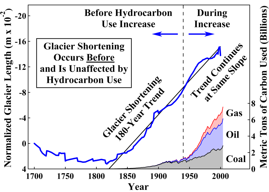
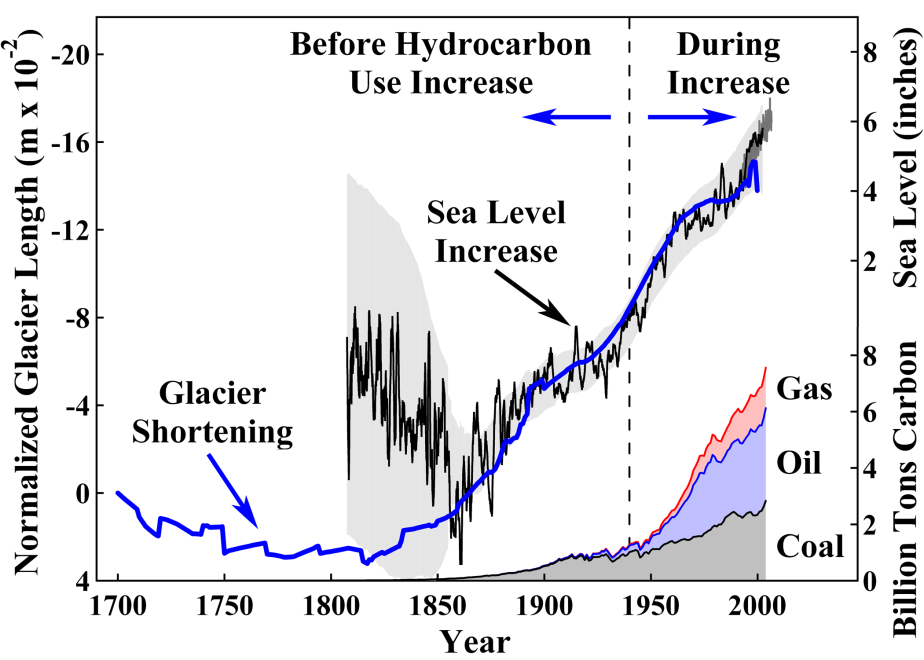
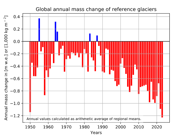
According to WGMS, the global mass of glaciers had not been increased since the 1980’s!
In the USA specifically (Alaska, Washington), the EPA also noted the rapid decrease almost every year recorded, after 2000!:
Sea Level Rise
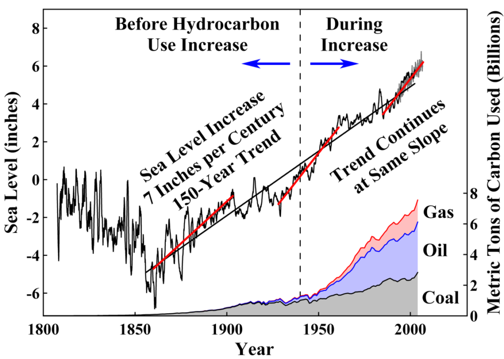
Robinsons’ report conveniently clips the data at 2000, where it still seems like it might be a linear increase. With more recent years we can see that it is in fact looking more like an exponential increase in recent years.
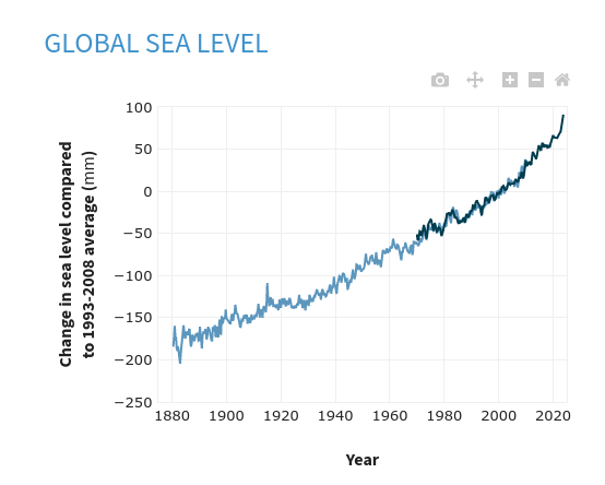
According to the official climate dashboard, “Sea level has risen between 8 and 9 inches since 1880. The rate of sea level rise more than doubled from 2006–2015 compared to the rate throughout most of the twentieth century.” Those several inches on average may not sound like much, but it is indeed something that many coastal communities are planning for to invest in infrastructure for the future.
Imported energy costs
Again, this chart doesn’t show the whole picture:
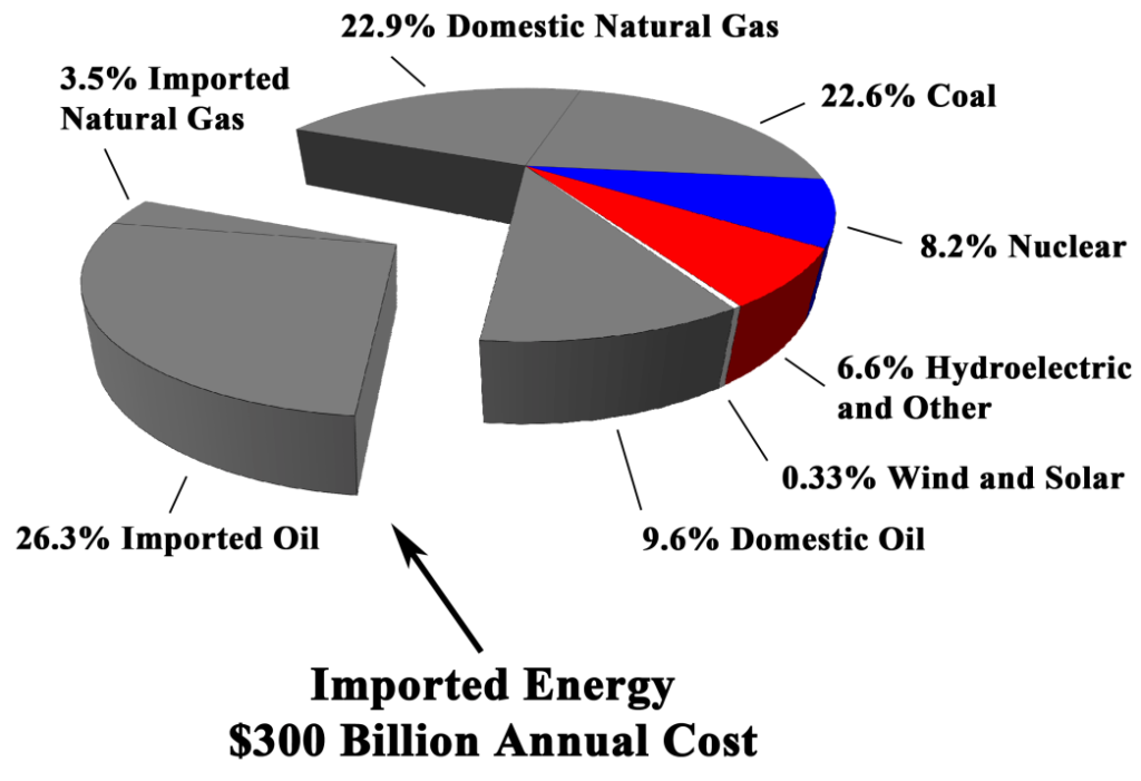
According go the most recent US Energy statistics, USA has been a net exporter with higher energy exports than imports.
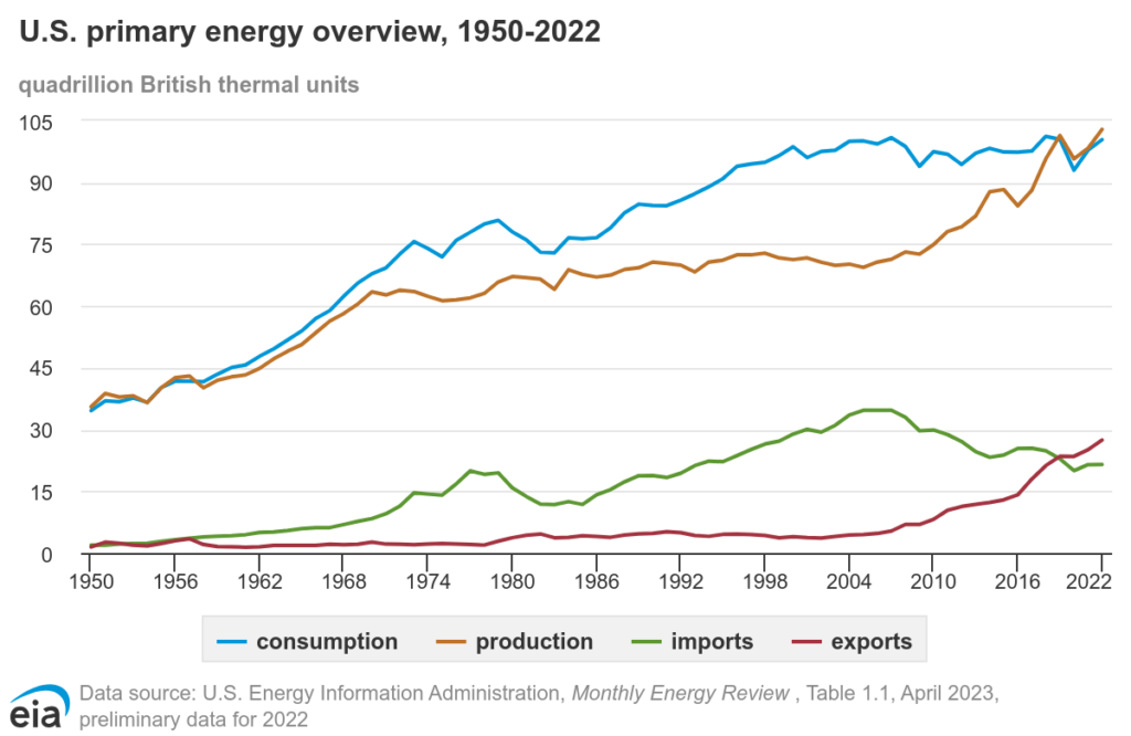
In fact, it was a newsworthy item recently in BusinessInsider, Washington Post that the total production of oil is the highest ever… in contrast to the implied high cost and dependence on other nations implied in Robinson’s charts.
Conclusion
If a chart ends in a year about 20 years ago and does not include important information that energy regulators need to consider, then it’s time to find some more recent data and work out what needs to be done today in response to our best scientists’ analysis.
In the paper “Environmental Effects of Increased Atmospheric Carbon Dioxide”, there is quite a bit of data that is not recently updated and not accurate. Since they source some generally reputable sources such as Nature and Science for this paper, I would hope they make an update to the paper with an analysis considering some more recent findings of the past few years:
From Science (Jan 2023): “For decades, some members of the fossil fuel industry tried to convince the public that a causative link between fossil fuel use and climate warming could not be made because the models used to project warming were too uncertain. Supran et al. show that one of those fossil fuel companies, ExxonMobil, had their own internal models that projected warming trajectories consistent with those forecast by the independent academic and government models. What they understood about climate models thus contradicted what they led the public to believe.”
From Nature: “The rate of warming has picked up over the past decade, and the average global temperature for 2023 is likely to be 1.4 °C above the average for 1850–1900 (see ‘Rising temperatures’).”
Indeed, 2023 was the world’s warmest year on record, by far – according to NOAA.